The core business risk was legal and reputational exposure hidden inside a basic compliance checklist. For an organization with the NFL Foundation’s visibility and mission, an inaccessible website undermines both ADA expectations and its commitment to the communities it serves. The audit uncovered failures across all four POUR principles, including color contrast issues, keyboard navigation barriers, missing ARIA labels, and unclear heading structure. Manual testing alongside automated scanning revealed real-world problems that tools alone cannot detect. The result was a prioritized remediation roadmap that reduces legal risk and strengthens the experience for all users, especially the veteran and youth populations the foundation was built to support.
Screen reader friendly pdf
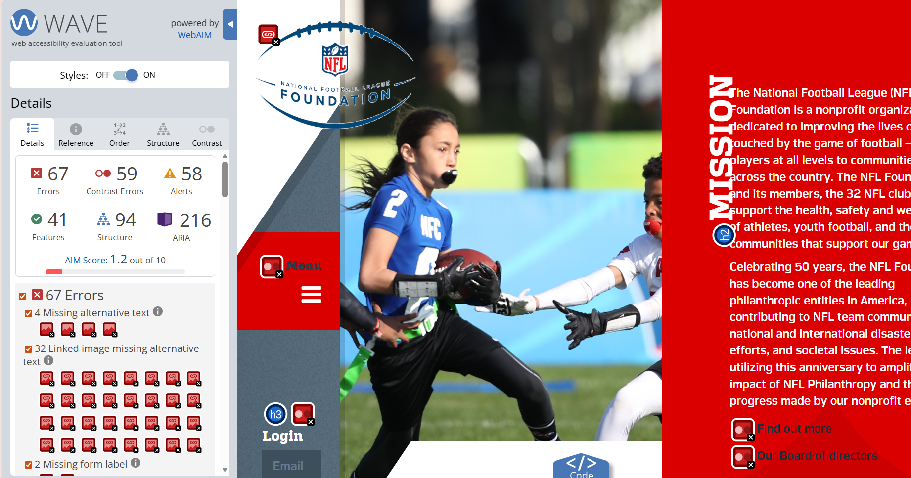
This case study presents an accessibility audit of the NFL Foundation website, evaluated against WCAG 2.1 Level AA standards. The audit focused on identifying barriers that could prevent users with visual, motor, or cognitive disabilities from fully accessing content and functionality.
The goal was not only compliance, but practical usability improvements that support inclusive access for all users.
A combination of automated and manual testing methods was used to capture both technical issues and real-world usability barriers.

Identified missing alt text, color contrast failures, missing form labels, and ARIA landmark issues.

Evaluated logical tab order, focus visibility, and access to all interactive elements without a mouse.

Assessed whether links, buttons, headings, and landmarks were announced clearly and in a logical structure.

Tested layout stability, readability, and horizontal scrolling at increased zoom levels.
Low contrast between text and background makes content difficult to read for users with low vision or color perception differences.
1.4.3 Contrast (Minimum) — Level AA
Unclear or missing labels on links and buttons create barriers for keyboard and screen reader users, making navigation inefficient or confusing.
Inconsistent heading hierarchy and insufficient ARIA labeling make it difficult for assistive technology users to understand page structure and relationships.
The website currently falls short of WCAG 2.1 Level AA standards, presenting several barriers for users with visual, cognitive, or motor disabilities. Key issues include low color contrast, unclear or missing labels on interactive elements, inconsistent layouts, and insufficient ARIA attributes. While some accessibility features exist, significant improvements are needed to ensure a more inclusive and user-friendly experience for all.
“Nothing for us, without us.”
Inclusive design starts by listening to the people most impacted.
Accessibility isn’t a penalty, it’s a winning strategy. Ready to team up?